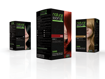
The Santé Verte brand had been very popular in France for many years. But it was felt that the brand needed to modernism and evolve the look to bring it in line with the 21st century.
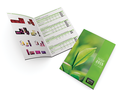
With this re-brand we completely redesigned the product catalogue, changing the orientation, look and style to reflect the brand itself, ‘Santé Verte’ meaning ‘Green Health’. This was achieved by using an uncoated matt stock to give a clean and natural feel.
The old catalogue reflected the black look revolving around the logo. This look made the catalogue feel very dated, unclean and truly did not reflect the ‘Green Health’ the company was hoping to achieve.
Taking this into consideration, the catalogue was produced with a light uncluttered feel throughout the design. Fully embracing the natural aspect of the products sold through Santé Verte.
Taking this into consideration, the catalogue was produced with a light uncluttered feel throughout the design. Fully embracing the natural aspect of the products sold through Santé Verte.


