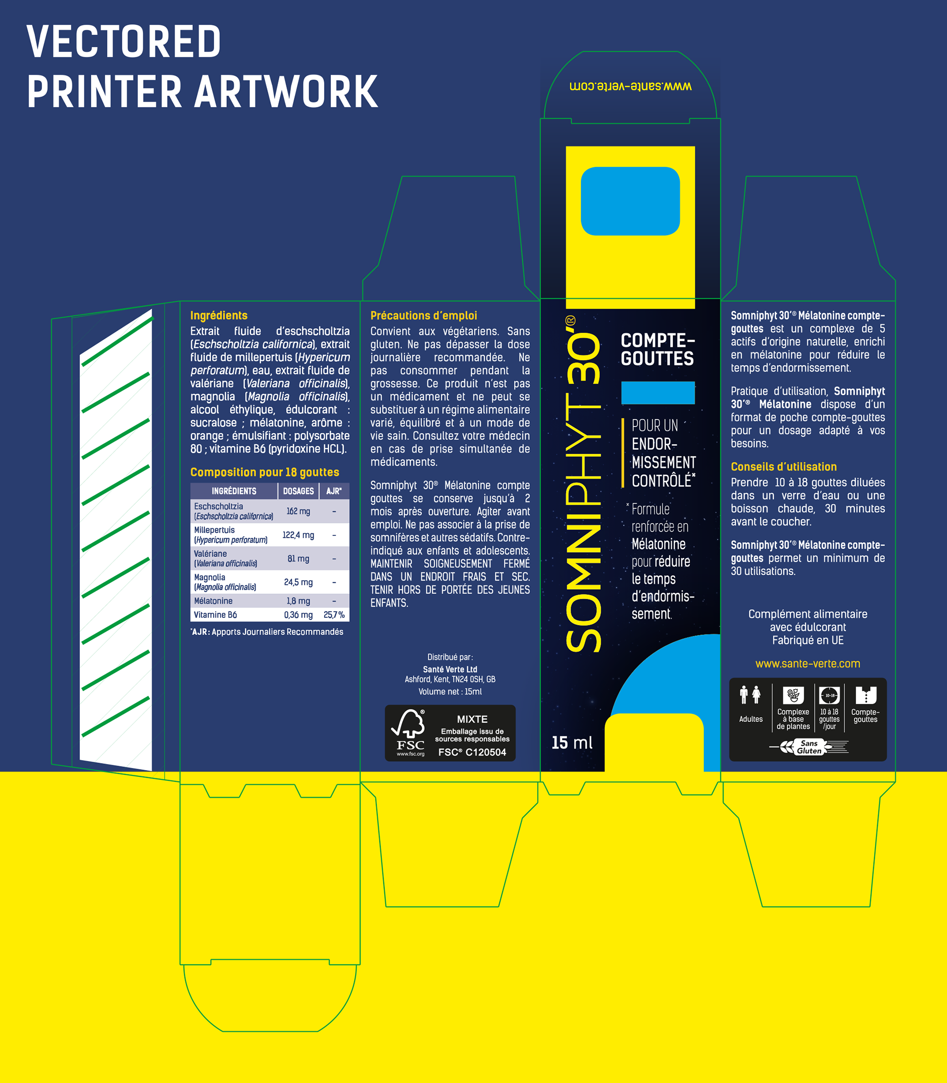
The original packaging for the SOMNIPHYT 30’ was very dated and really stuck in the 80’s.
As the whole of the Santé Verte brand has gone under a re-brand, it was time for this range.
As the whole of the Santé Verte brand has gone under a re-brand, it was time for this range.
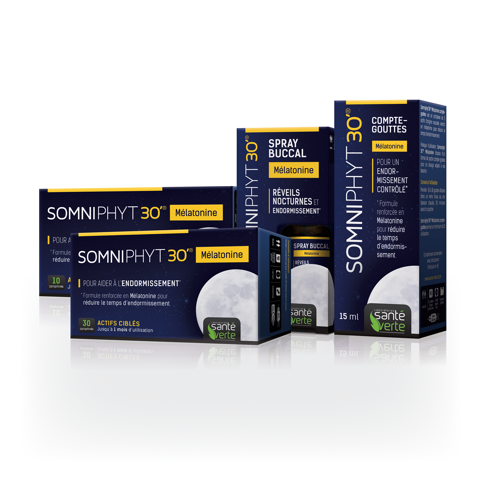
The brief didn’t stray too much from the original packaging with regards to colour as clients were use to seeing a sleeping product in these colours. But the introduction of the star background with the moon really gets across the relationship to a sleeping product with the slight splash of yellow throughout which bring your attention to the key selling points of the product.
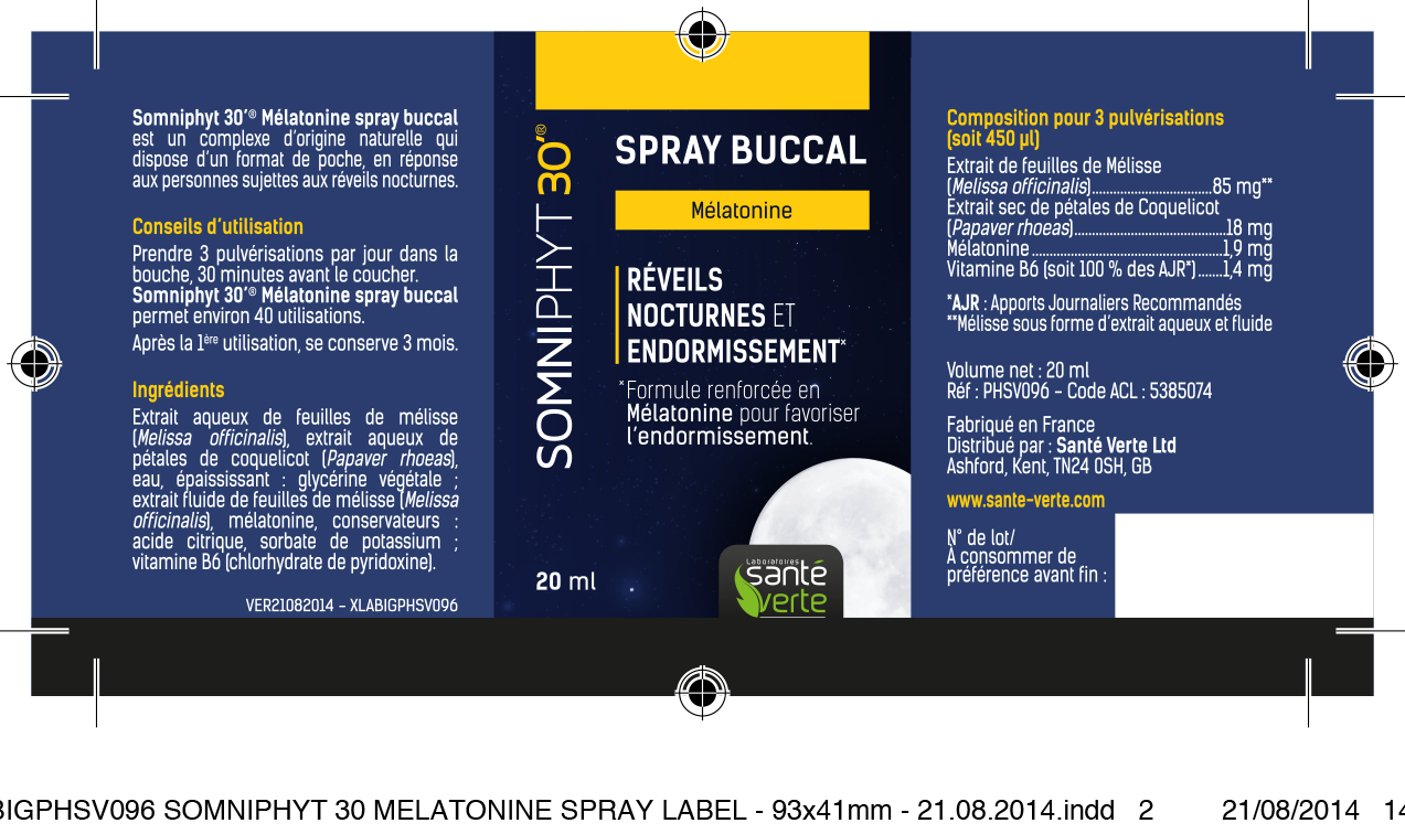
With the ’Spray Buccal’ product I was able to incorporate the moon shape within a window cutout of the packaging to fully utilise this aspect.
The range preview image shows how I was able to keep constancy throughout a number of products of varying sizes.
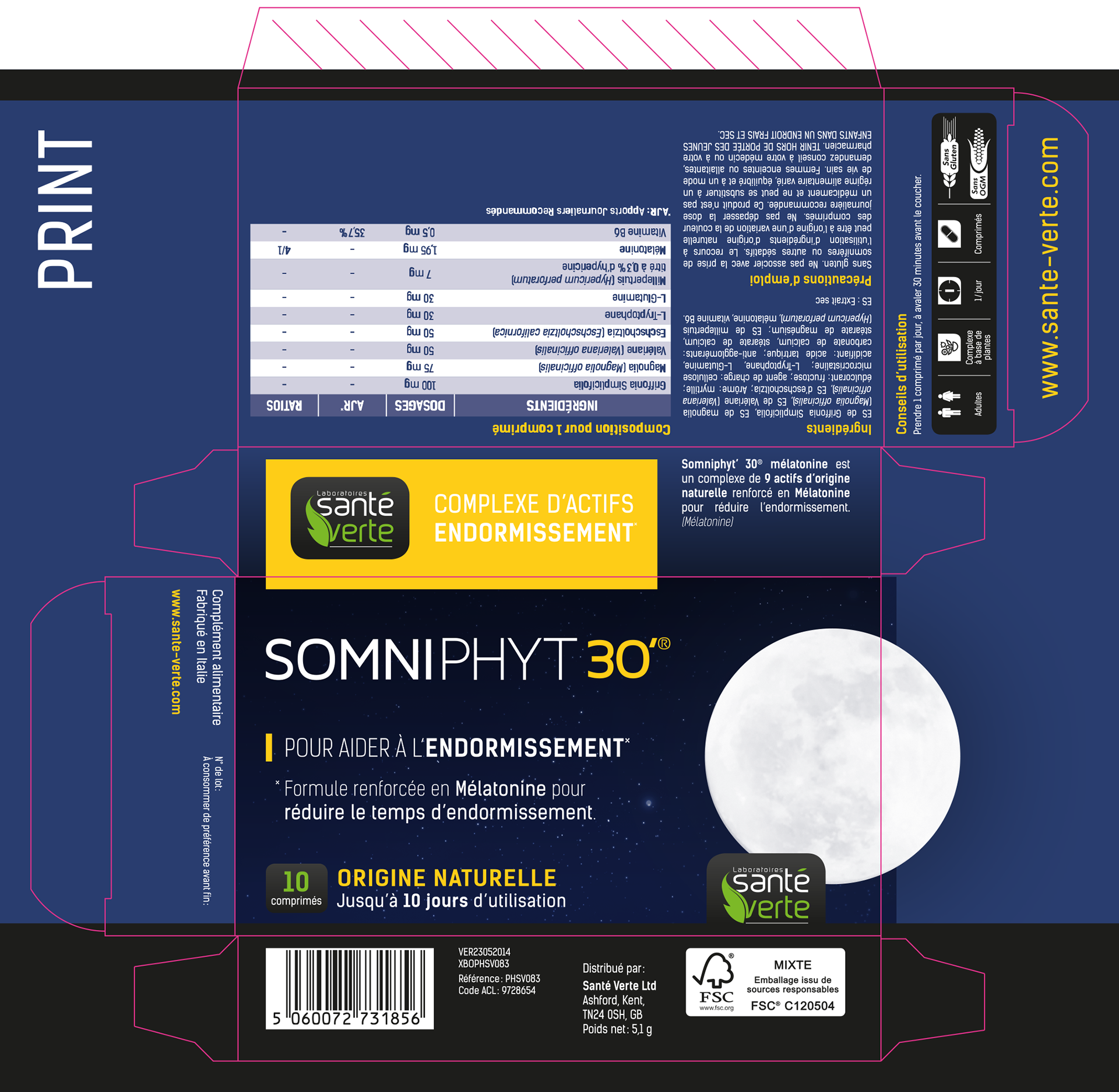
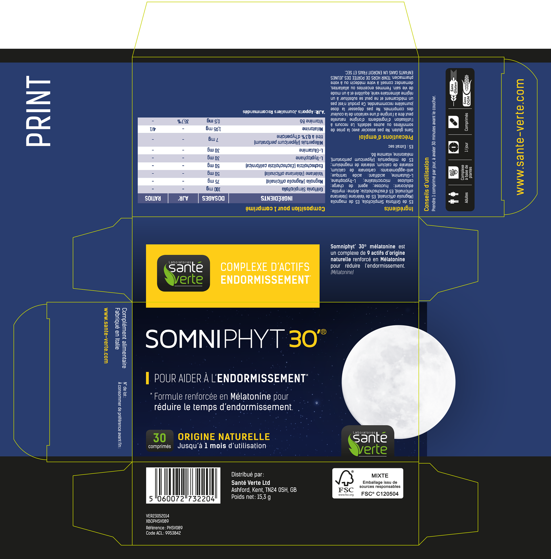
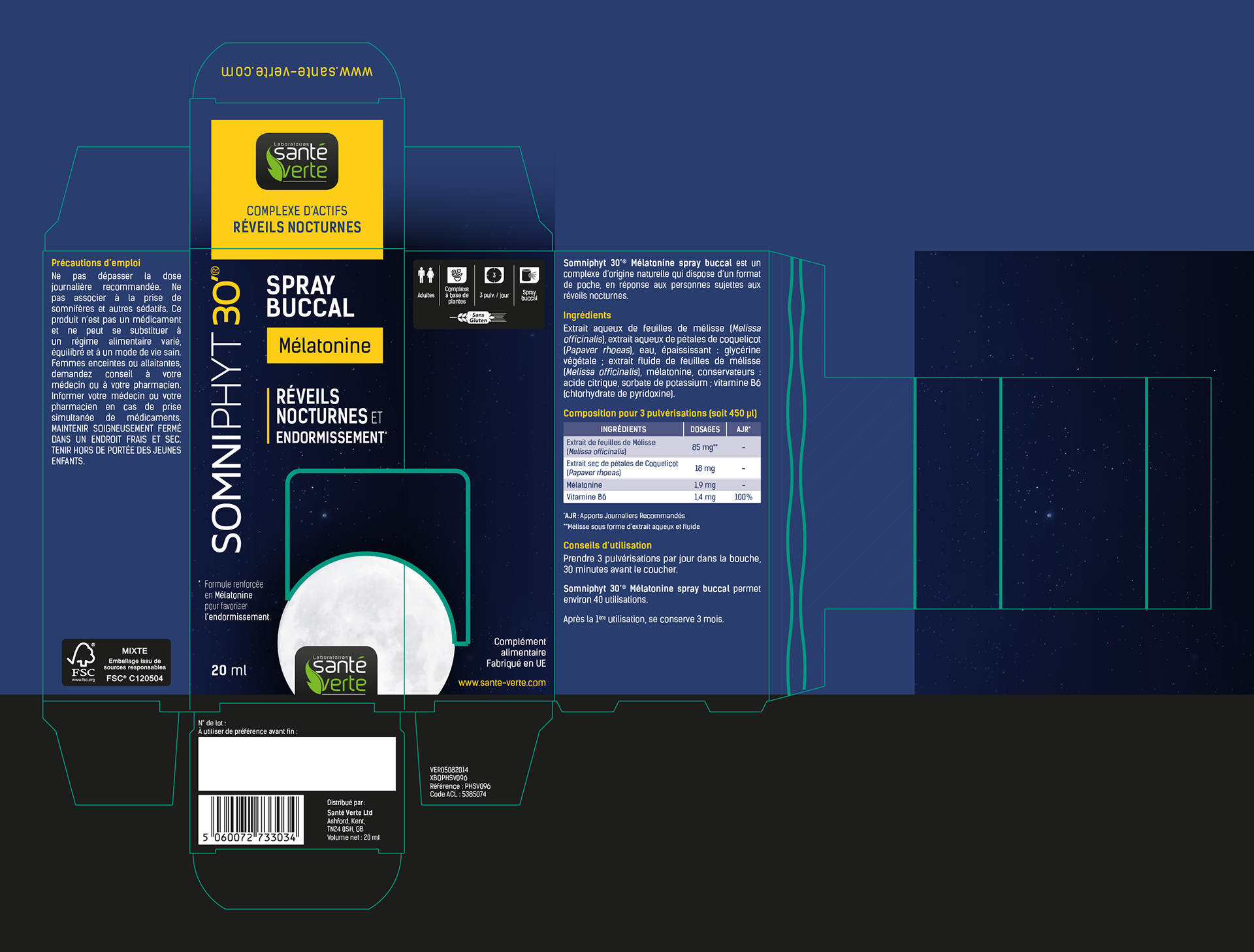
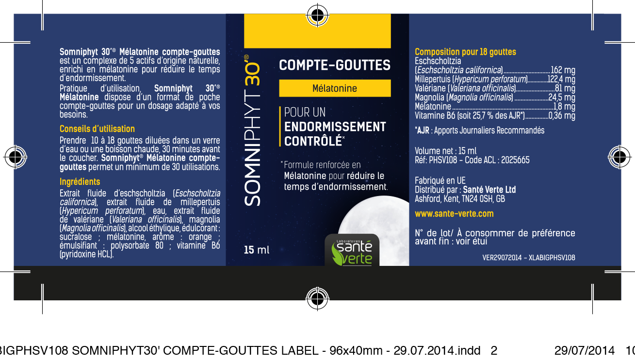
You can see I the design of the packaging was created from the live flat artwork I have included, with the compte-gouttes pack showing the spot UV and embossing plates.